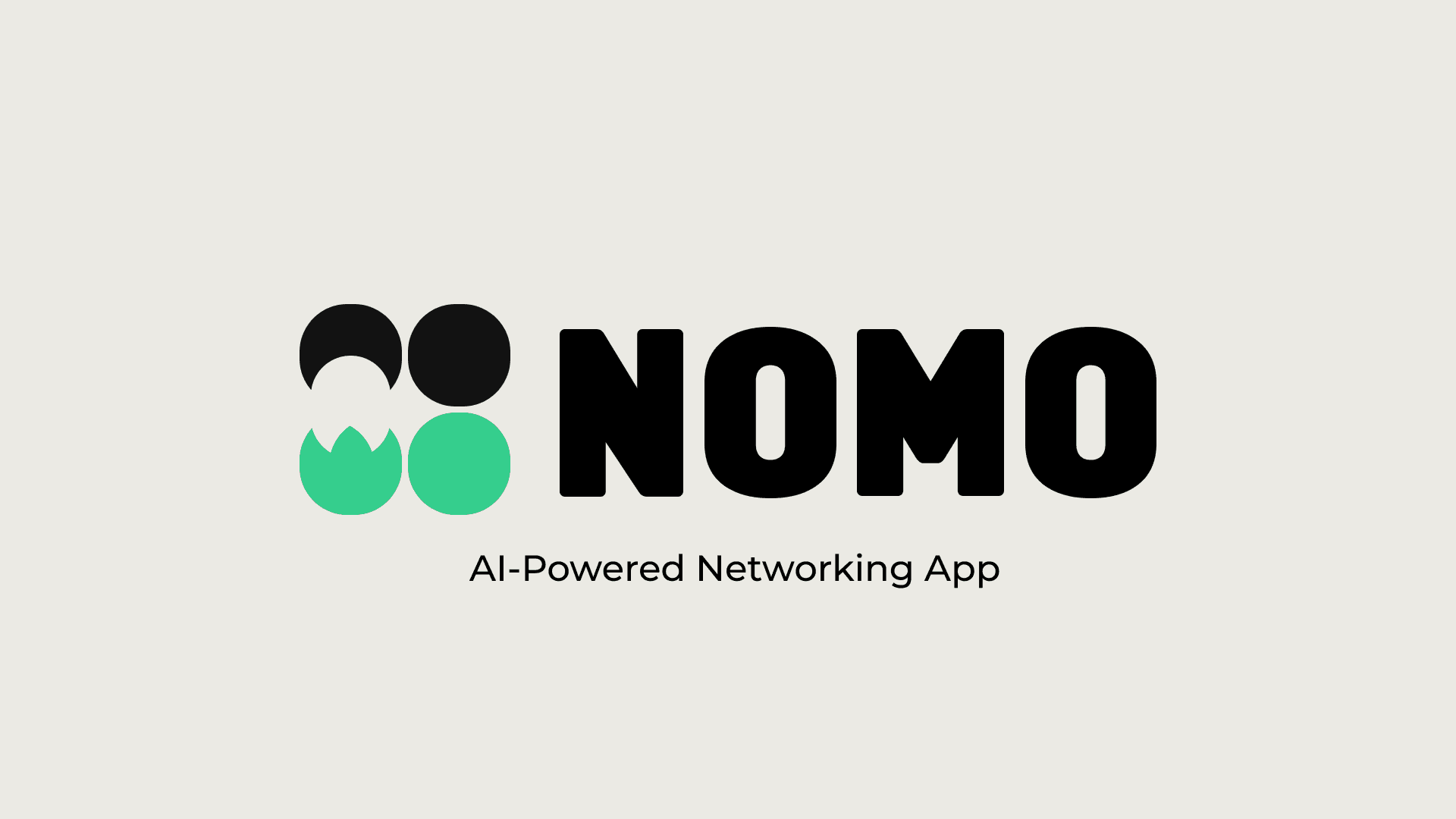
NOMO
UX DESIGN
STRATEGY
Context
Nomo is an AI-powered professional networking app, previously known as Zimplist. The project focused on redesigning the existing product experience to better support meaningful, long-term professional connections.
This redesign was created while working at Inheaden, as part of a client engagement aimed at repositioning the product for investor conversations. The goal was to modernize the app visually and conceptually, while introducing AI-assisted features that make networking more intentional and personal.
My Role & Team
I worked on this project as a UI/UX Designer, collaborating closely with another UI/UX designer at Inheaden.
My responsibilities included:
UX concept development and redesign
User flow definition
Low- and high-fidelity wireframing
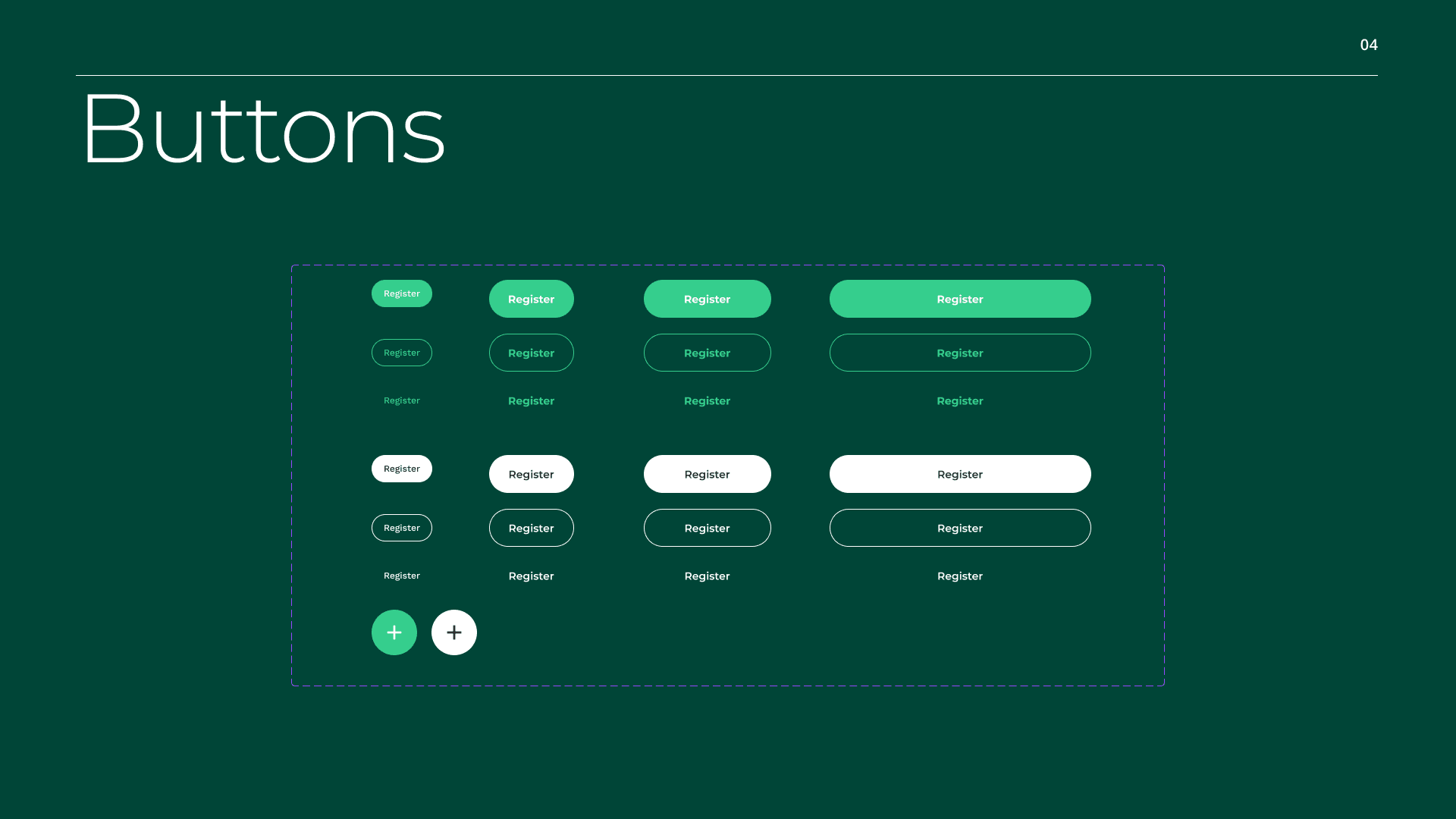
Visual direction, including logo, color palette, and UI system
Prototyping and interaction design
All design work was carried out in alignment with the client brief and under Inheaden’s project scope.
The Challenge
The existing app (Zimplist) lacked a clear product story and a modern user experience that could convincingly support investor pitches.
The key challenges were:
Translating professional networking into a focused, low-friction mobile experience
Reducing the chaos often associated with contact collection after events
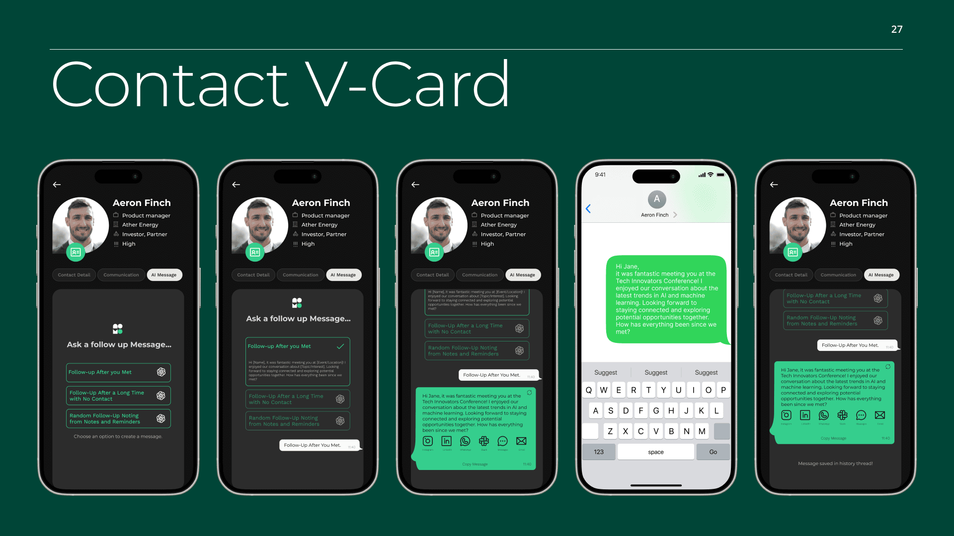
Integrating AI features in a way that felt helpful, not intrusive
Creating a visual identity that felt credible, modern, and scalable
The redesign needed to balance business goals (investor readiness) with user needs (clarity, ease, and meaningful follow-ups).
Process at a Glance
Explore → Align → Structure → Design
Started with a client brief focused on redesign and AI feature integration
Created multiple curated moodboards exploring different visual and product directions
Aligned with stakeholders on a dark, minimal visual direction
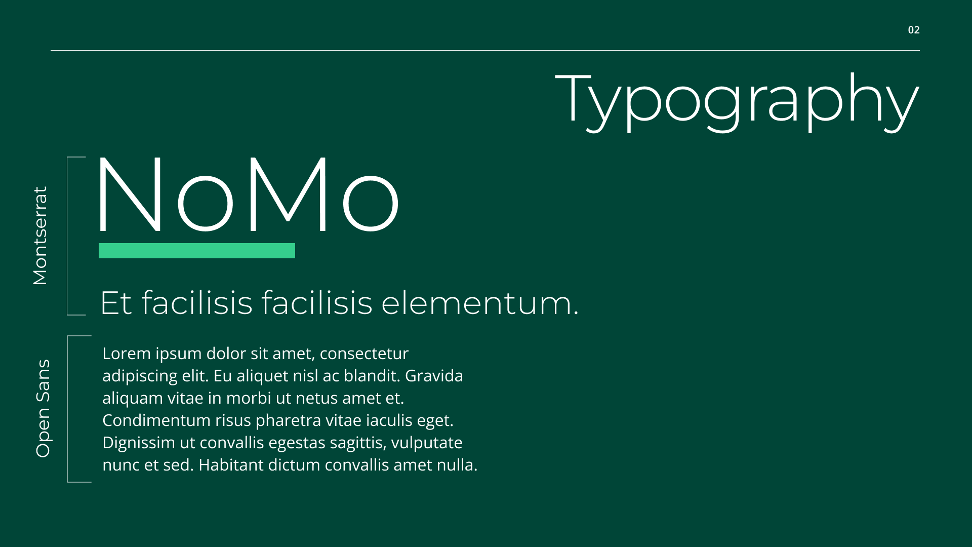
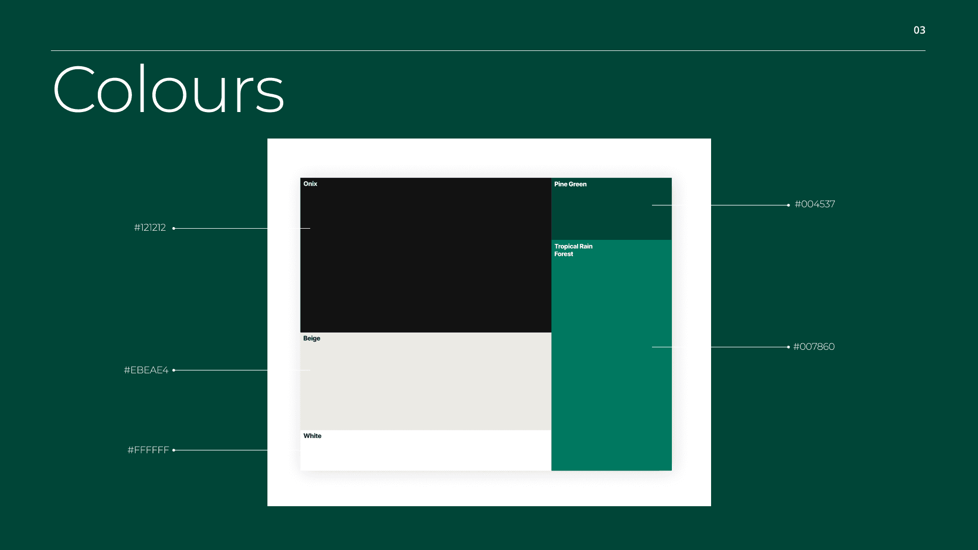
Developed a new logo and color palette to support the brand shift
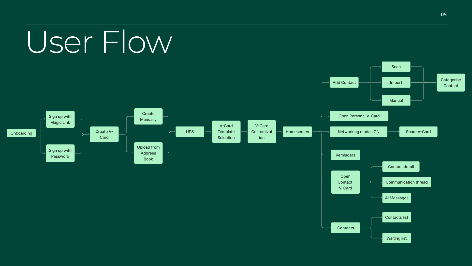
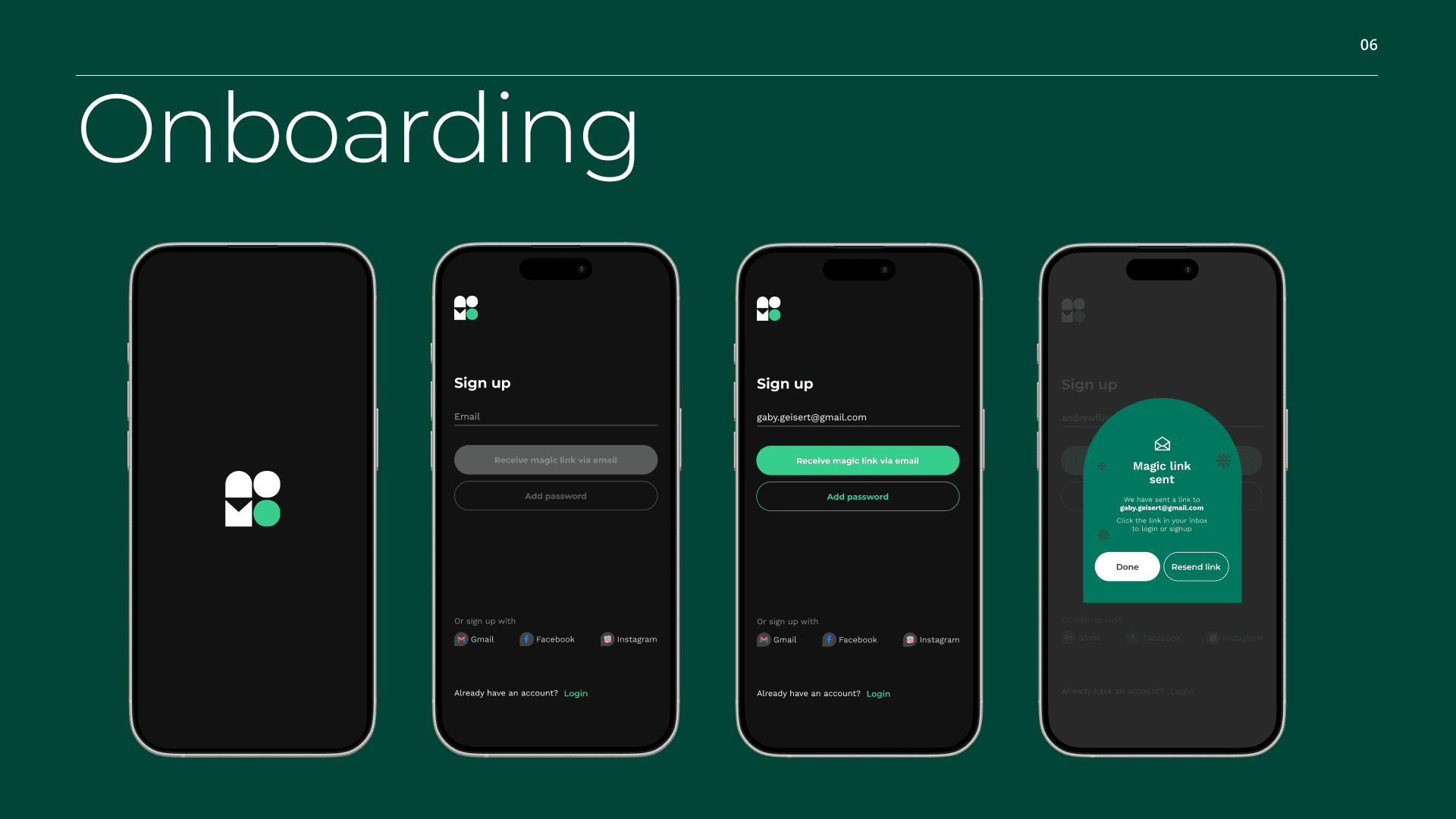
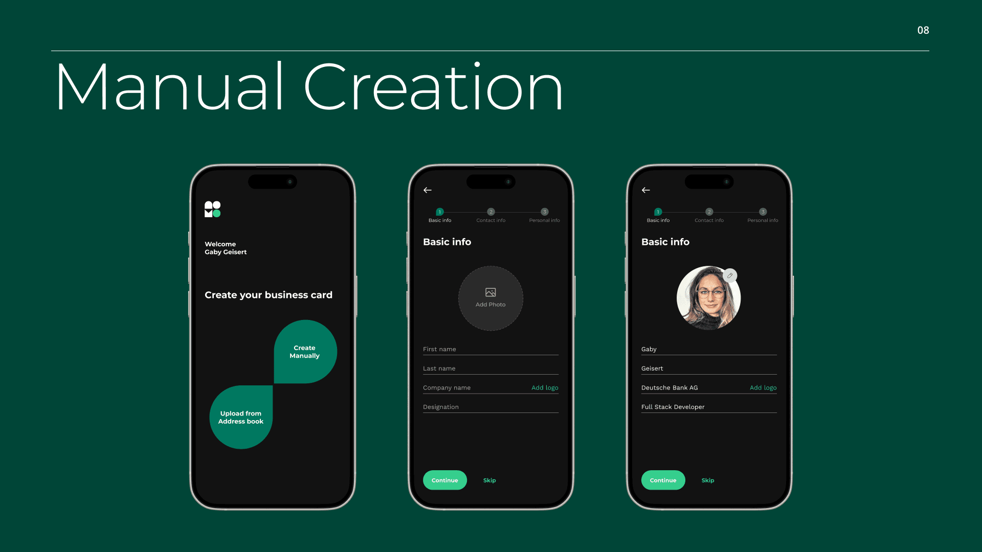
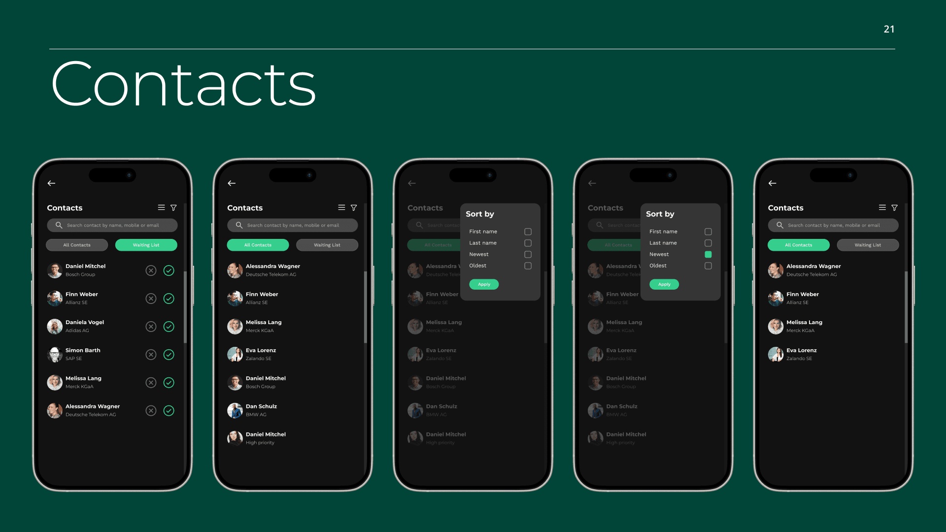
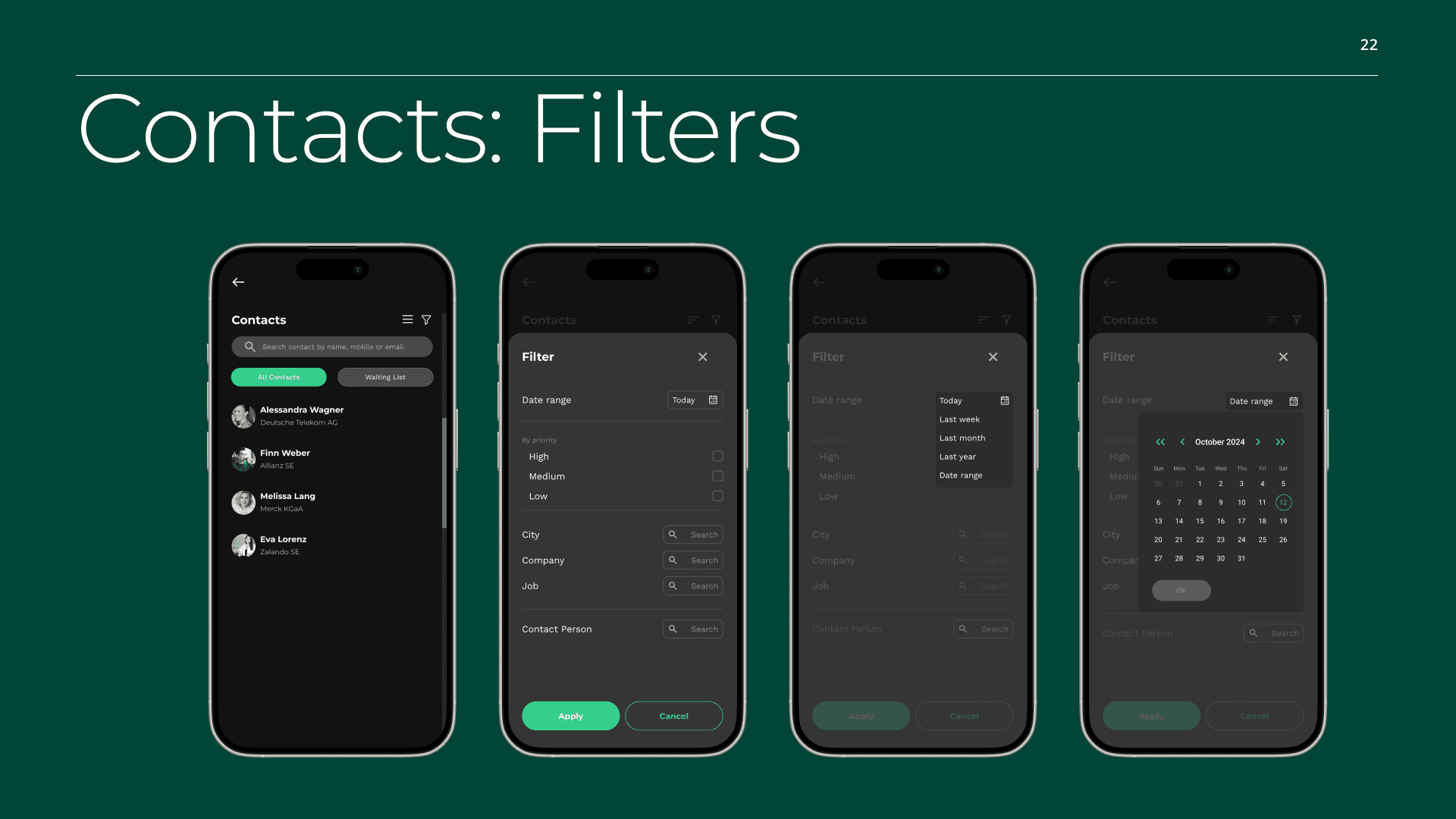
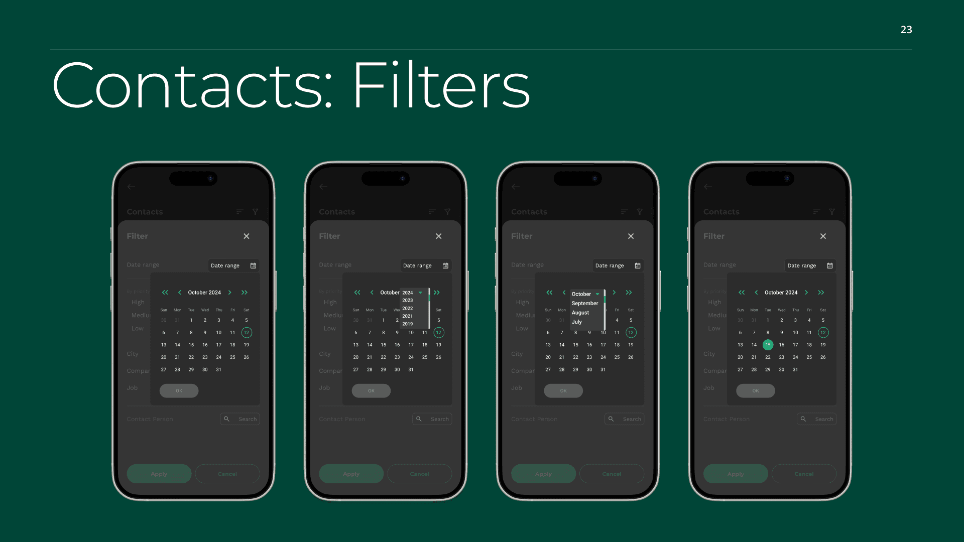
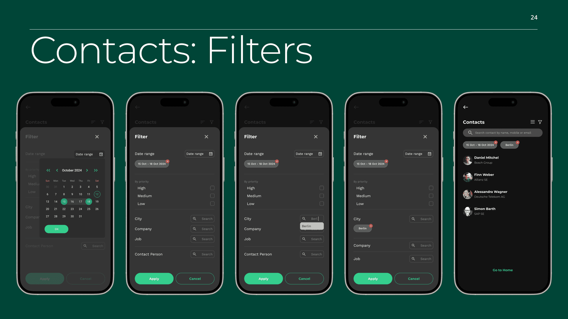
Defined core user flows for onboarding, networking, and contact management
Created low-fidelity wireframes to validate structure and flow
Finalized high-fidelity designs and interactive prototypes
The process prioritized clarity and decision-making over exhaustive documentation
Key Design Decisions & Insights
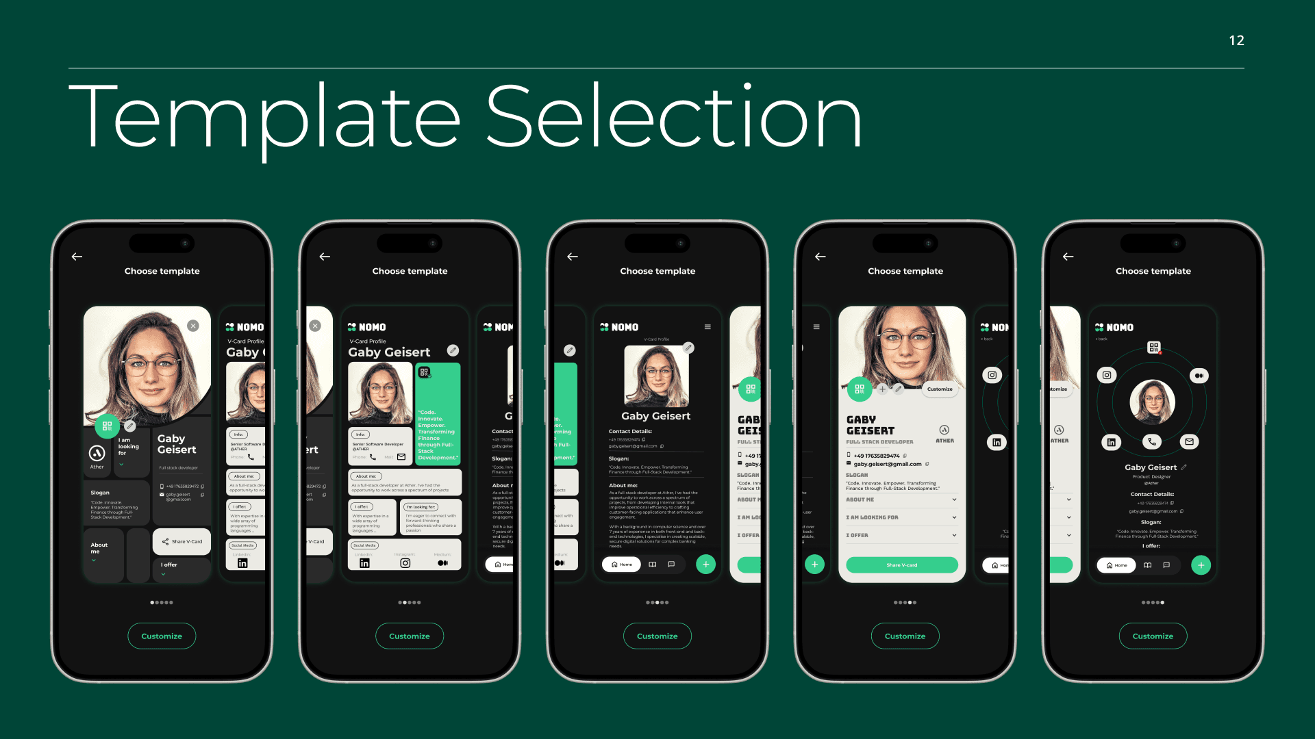
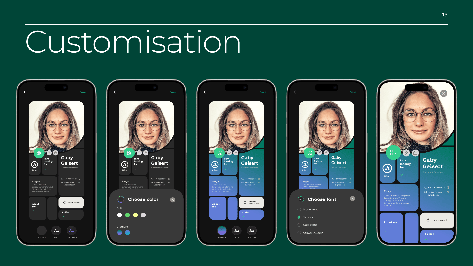
1. Dark UI as a credibility signal
A dark, minimal interface was chosen to support a professional tone, reduce visual noise, and position the product as a serious networking tool rather than a social feed.
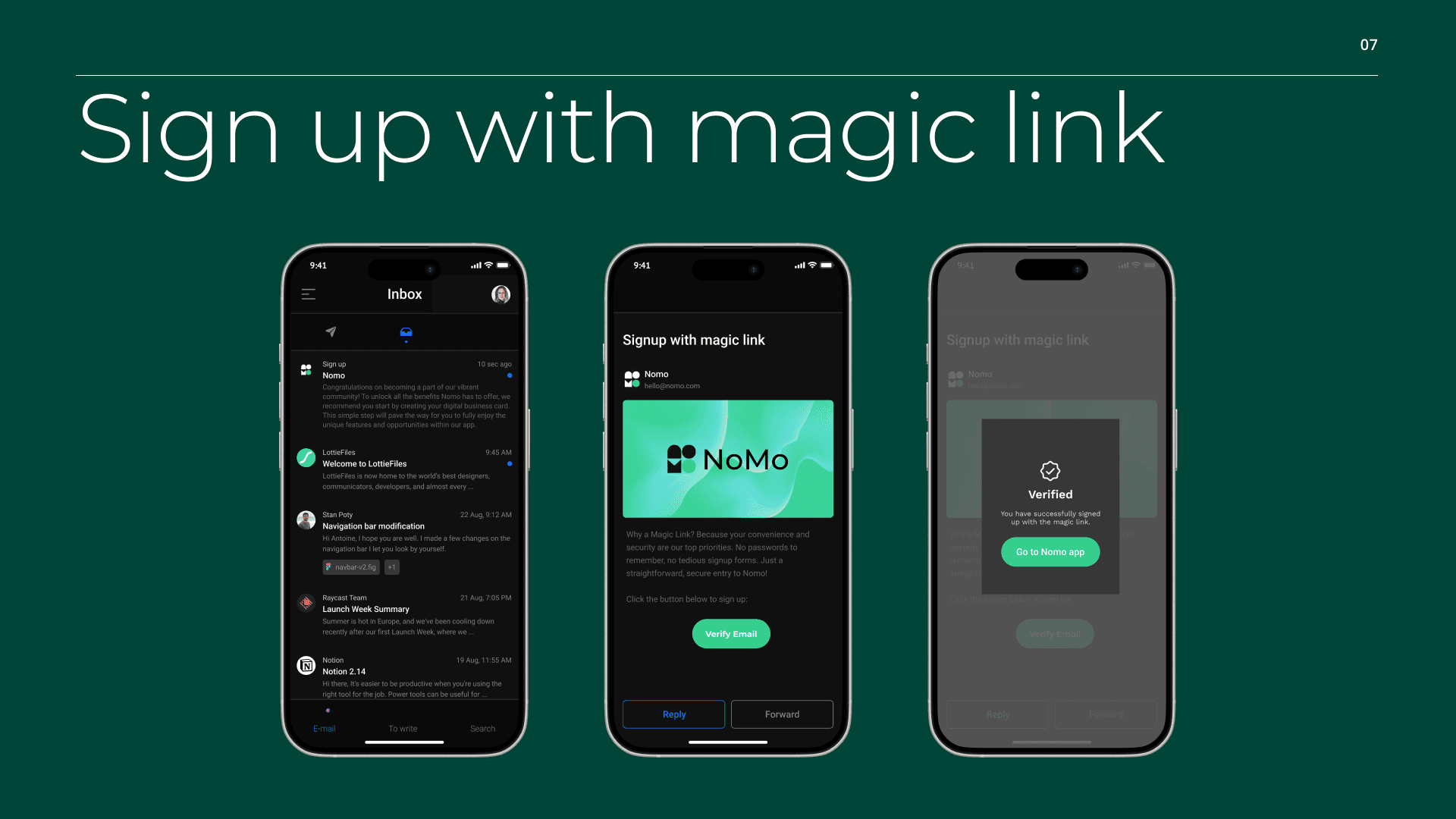
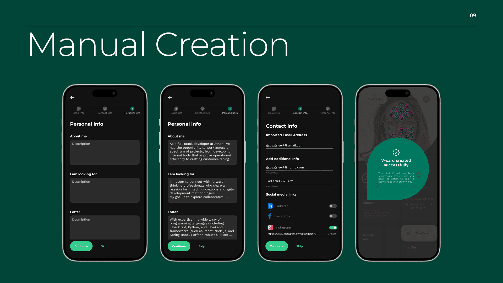
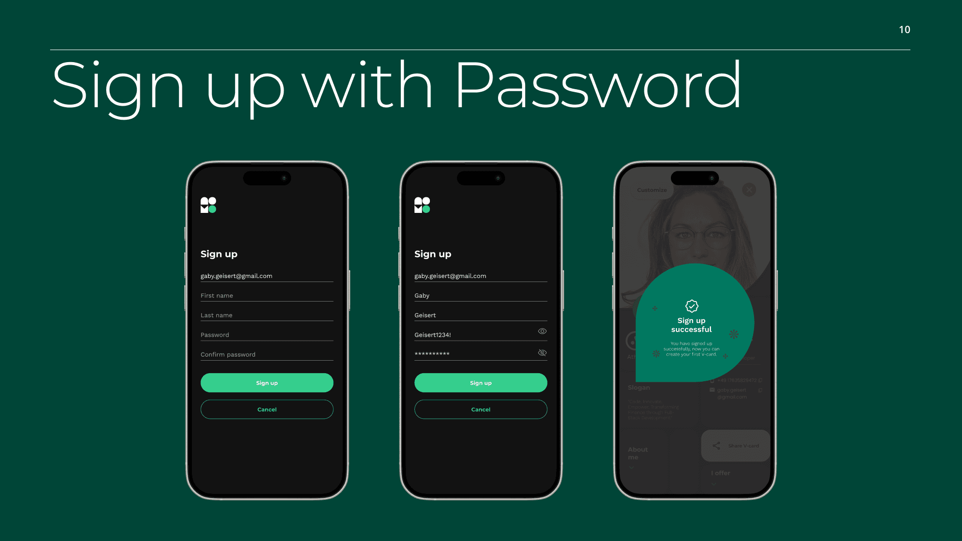
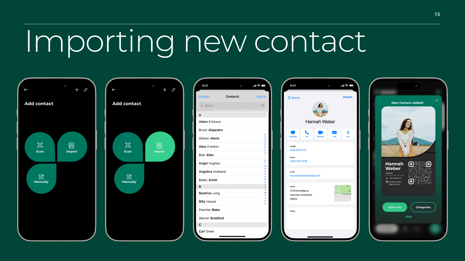
2. Friction-light onboarding
Magic link sign-up was introduced to reduce entry barriers, especially in event contexts where speed and convenience matter.
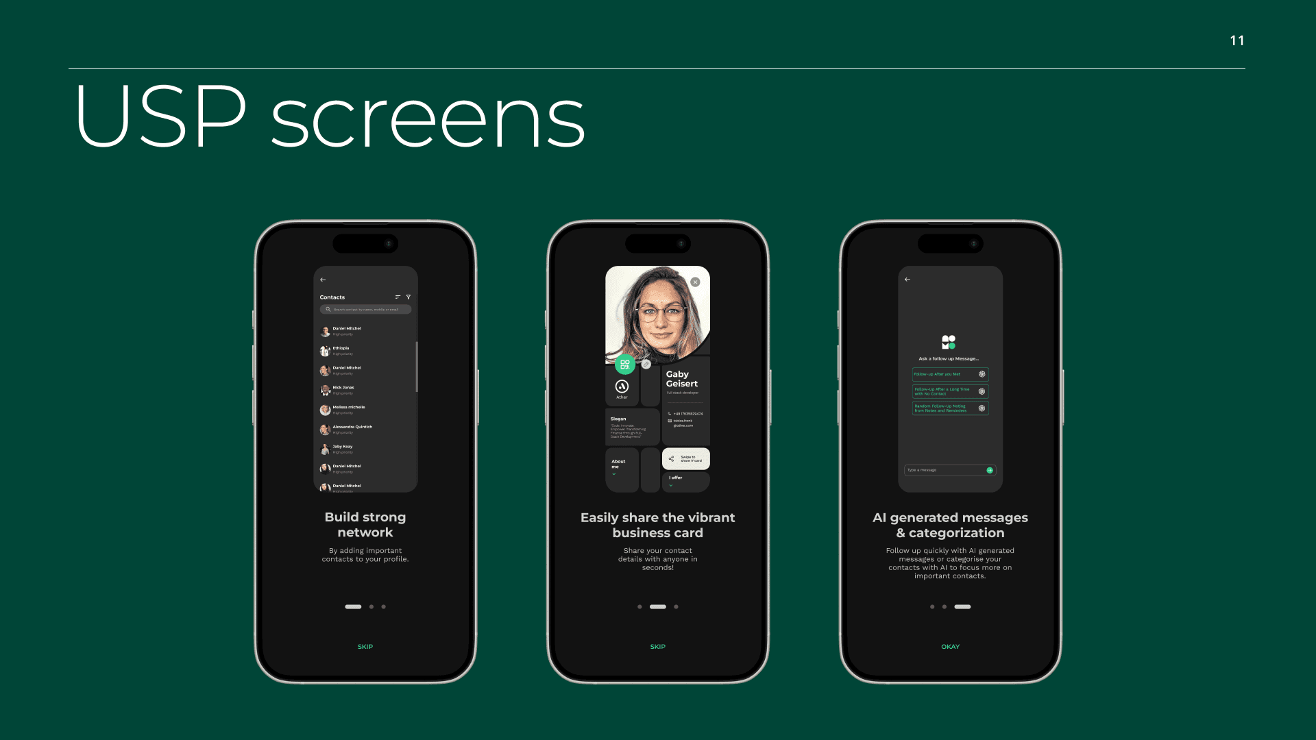
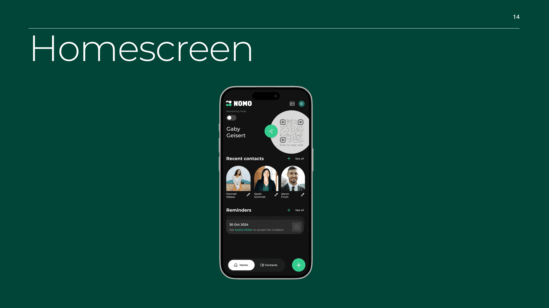
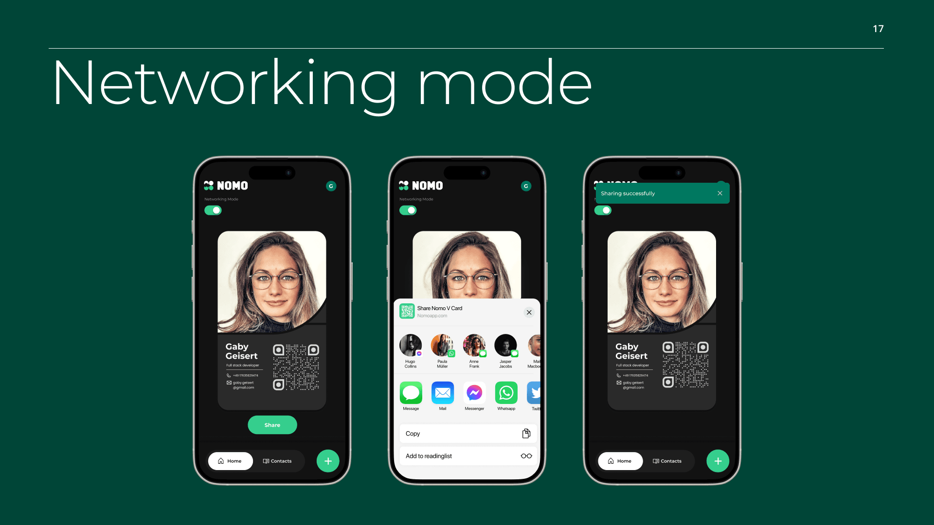
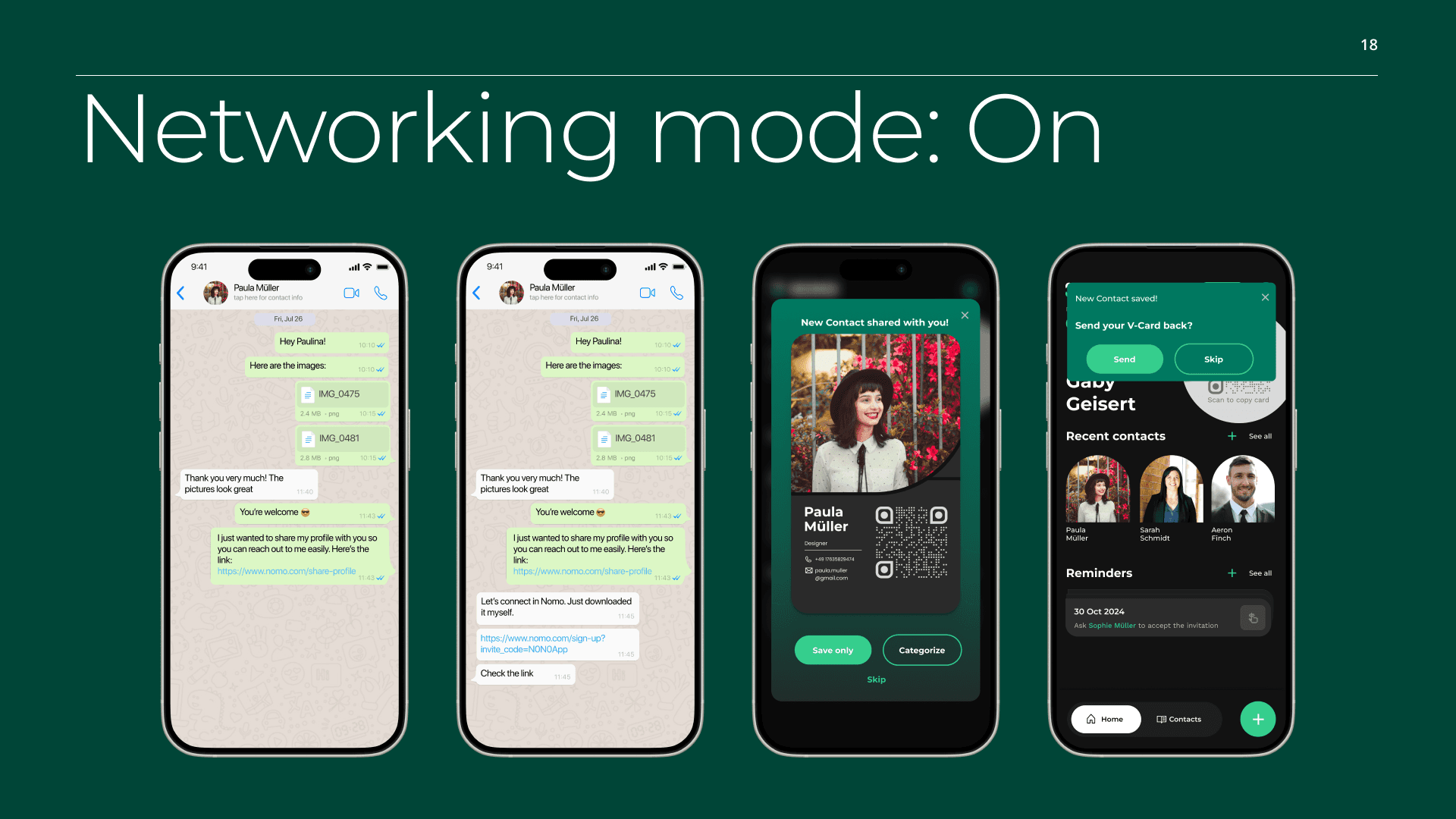
3. Networking as a moment, not a feed
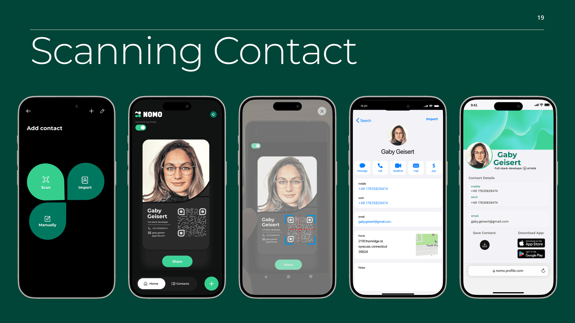
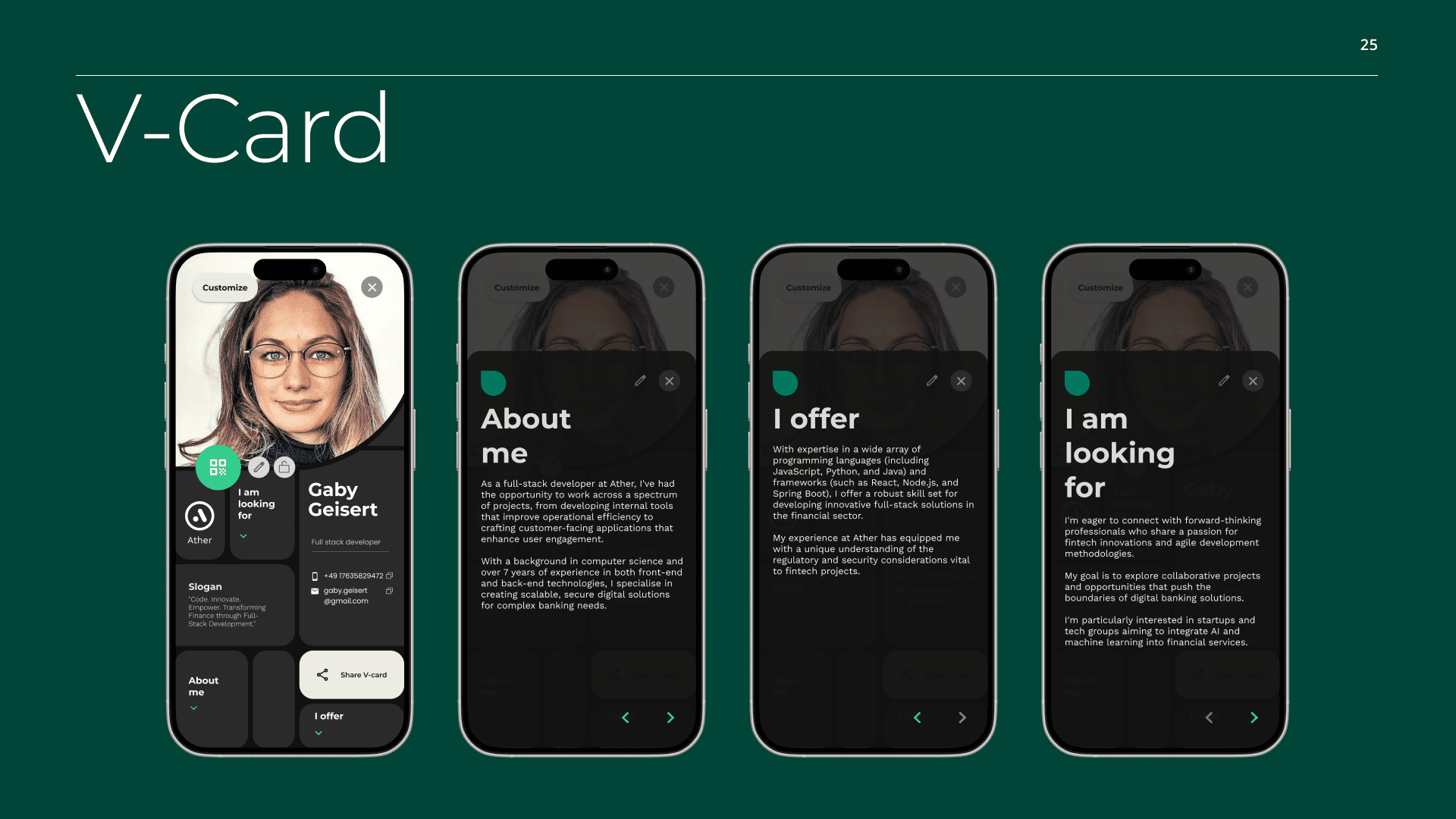
Features like “Networking Mode” were designed around real-world situations, allowing users to intentionally switch into a sharing and discovery state.
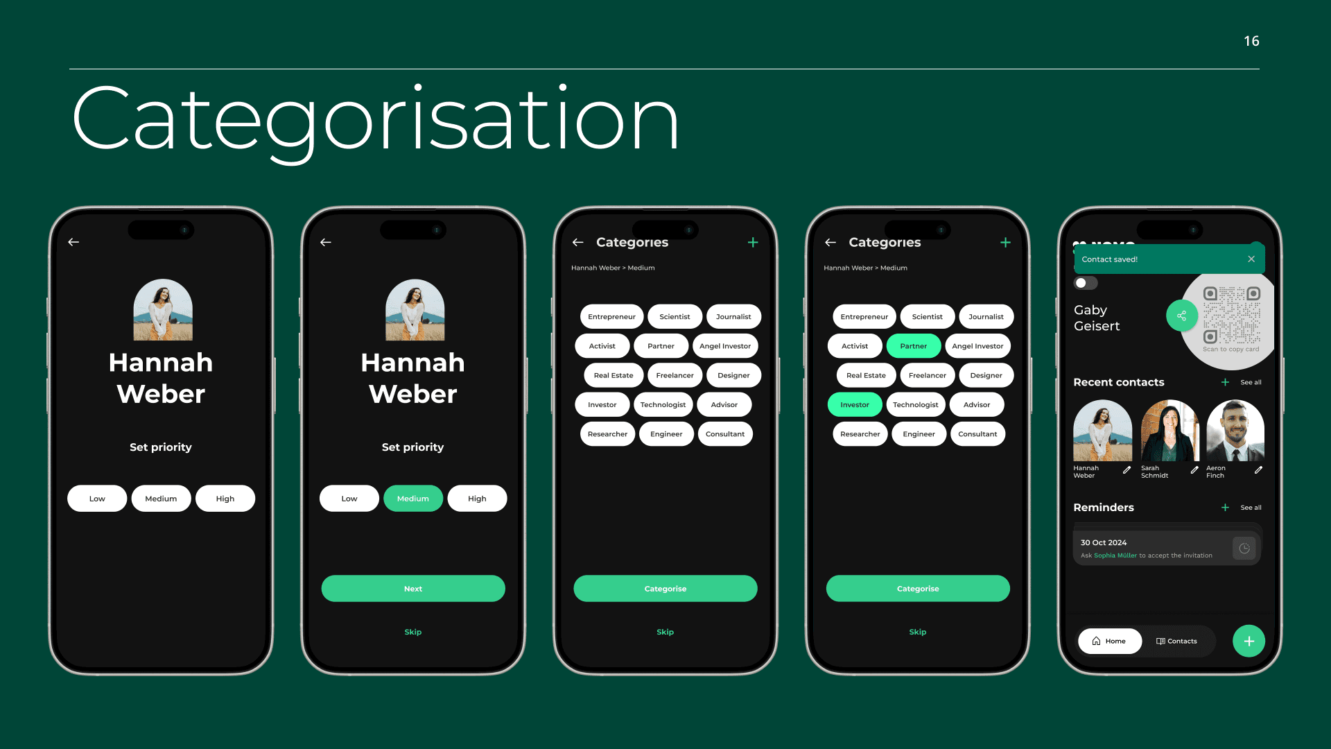
4. Structure over accumulation
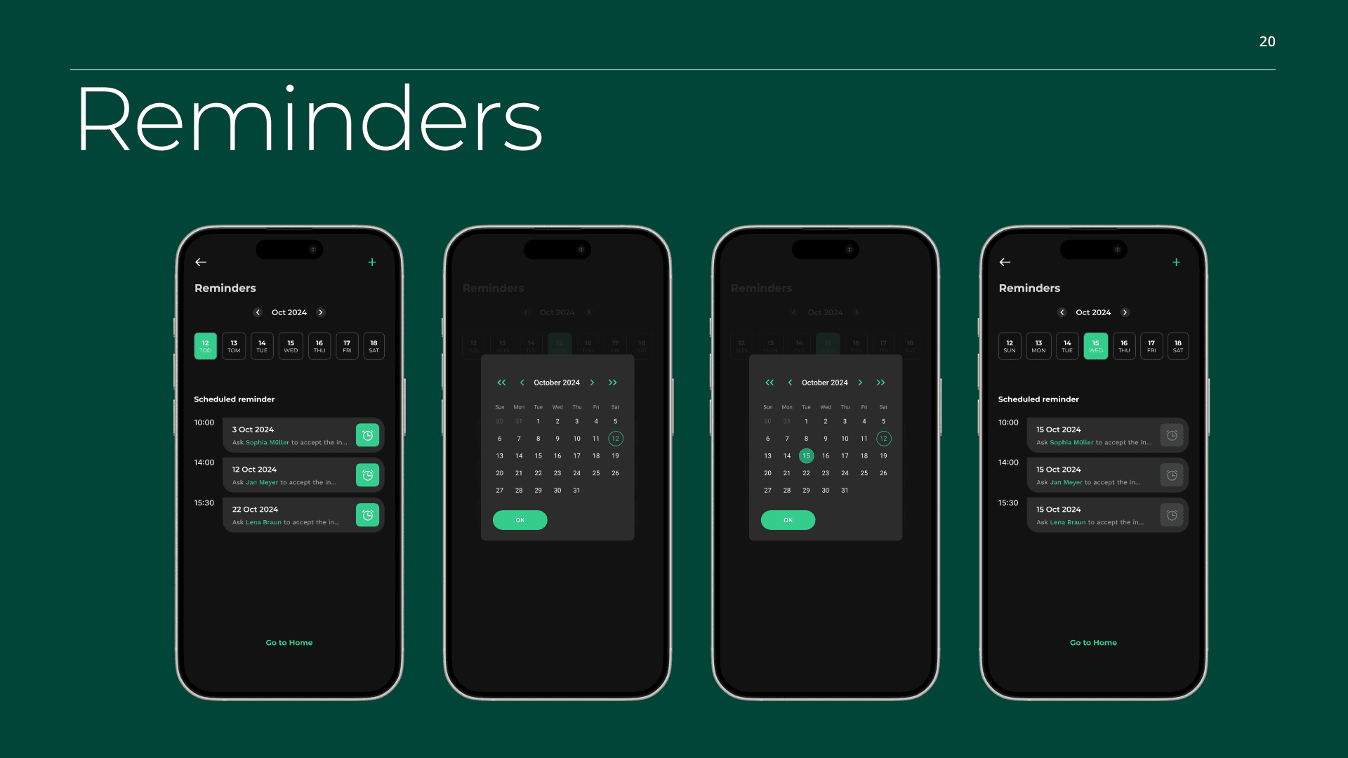
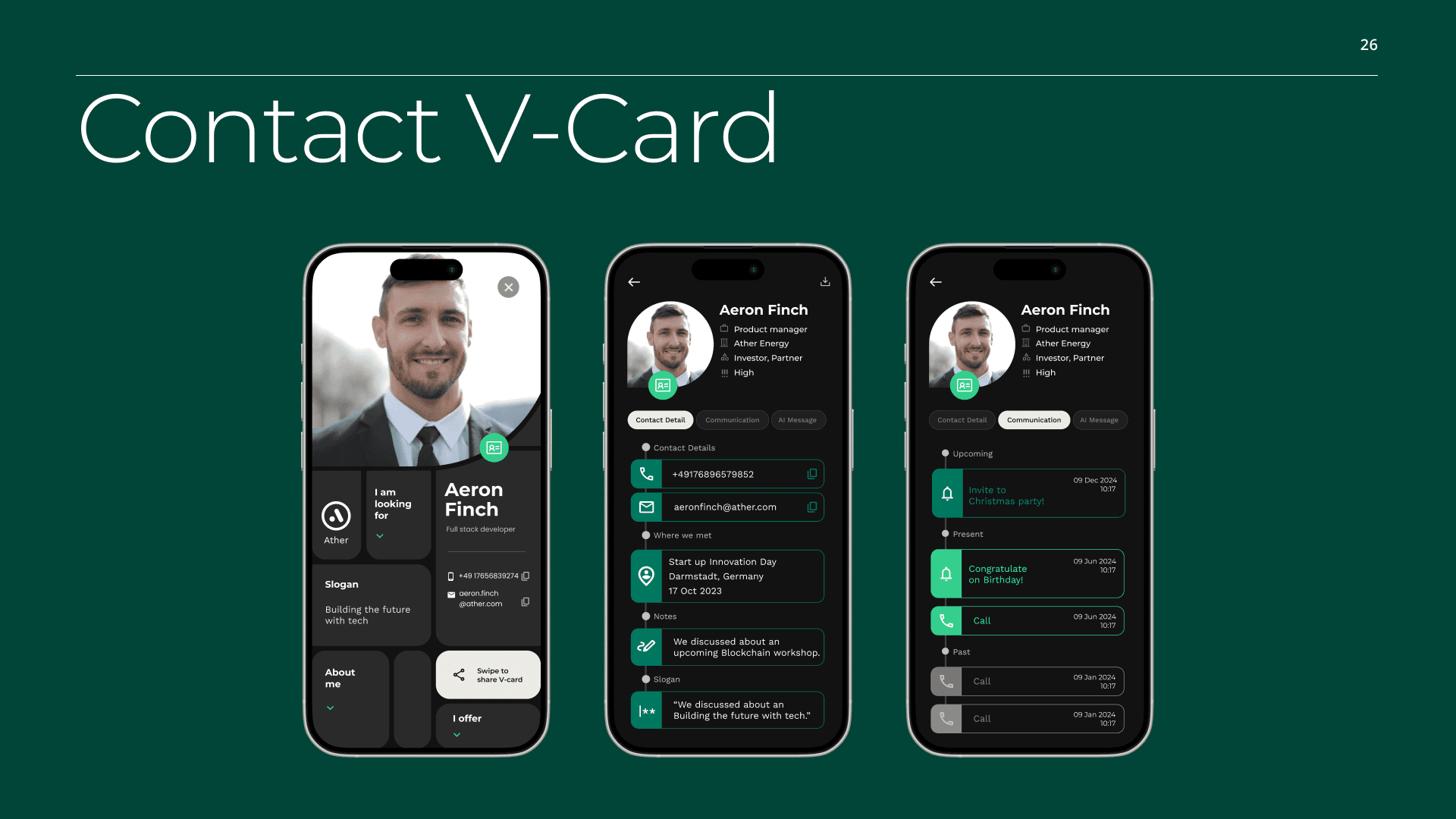
Categorisation, reminders, and AI-assisted suggestions help users manage contacts meaningfully after events, rather than letting connections get lost.
Outcome & Learnings
The Nomo redesign resulted in a cohesive product concept that clearly communicates value to both users and investors.
Key learnings:
Designing AI-assisted features requires restraint and clear intent
Networking tools benefit from situational UX rather than constant engagement
Strong visual direction can significantly elevate perceived product maturity
This project strengthened my approach to concept-driven redesign and social product UX.
👇 Explore the NOMO App in action in the prototype video below