Breaby
UX DESIGN
STRATEGY
Context
Breaby is an IoT-based product that connects a physical air-quality sensor with a companion mobile app.
The device measures environmental parameters such as CO₂, temperature, humidity, pollen, and air quality, while the app visualizes this data in real time and provides guidance on how users can improve their indoor environment.
The founders approached Inheaden with a 3D-printed device prototype and a product vision, but no existing app structure or UX strategy.
My task was to design Version 1 of the mobile app, translating complex sensor data into a clear, accessible experience for everyday users.
My Role & Team
My role: UI/UX Designer
Team setup: Worked solo on UX and UI design, in close collaboration with the founders and the Inheaden team
Responsibilities:
UX strategy for the companion app
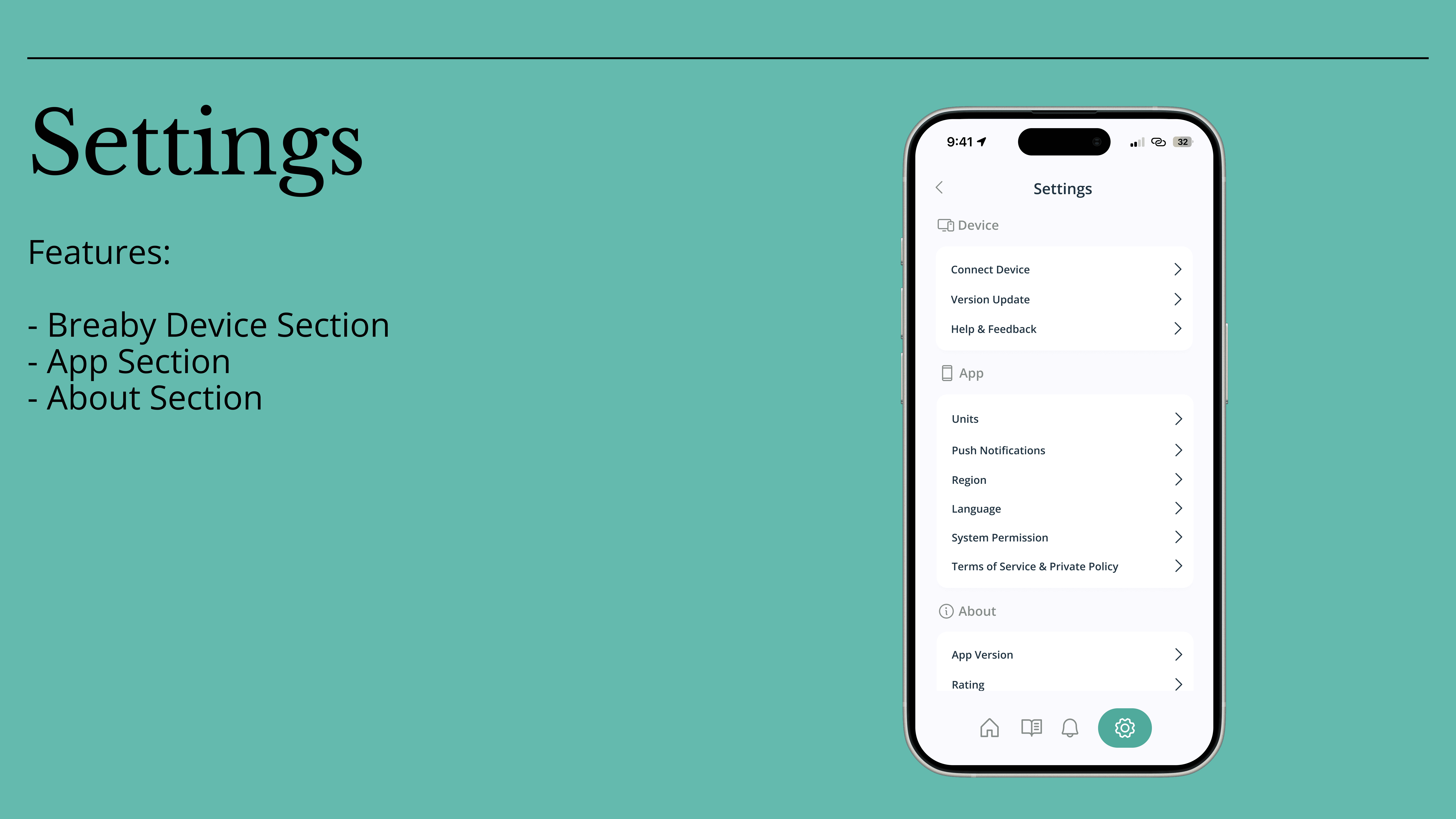
Information architecture and dashboard logic
User flows and interaction structure
Lo-fi and hi-fi wireframes
Visual direction (color system, spacing, UI tone)
I was responsible for the end-to-end app design, from early concept and structure to polished mobile screens.
The Challenge
The core challenge was simplifying technically complex environmental data without losing meaning or credibility.
Key challenges:
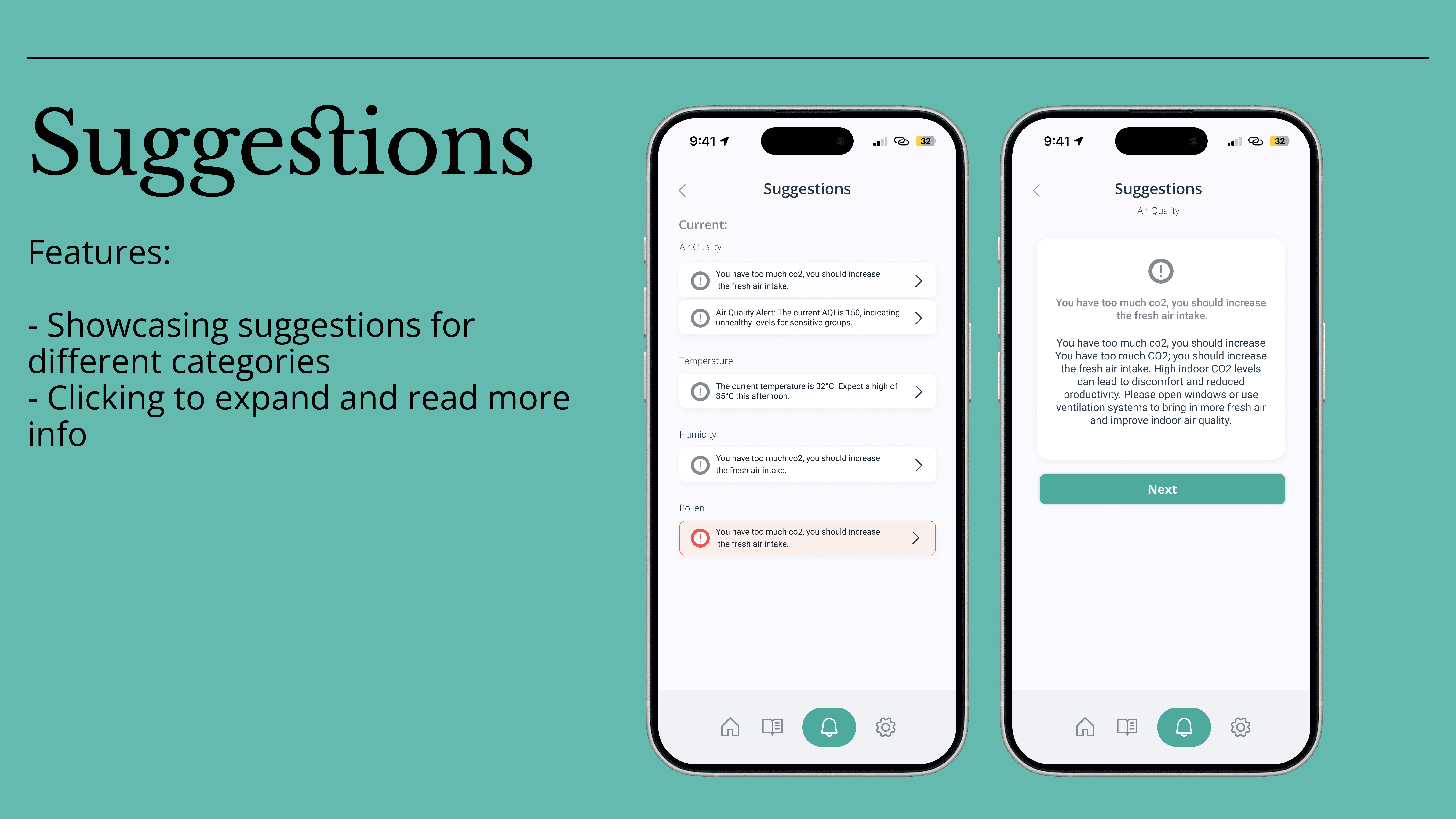
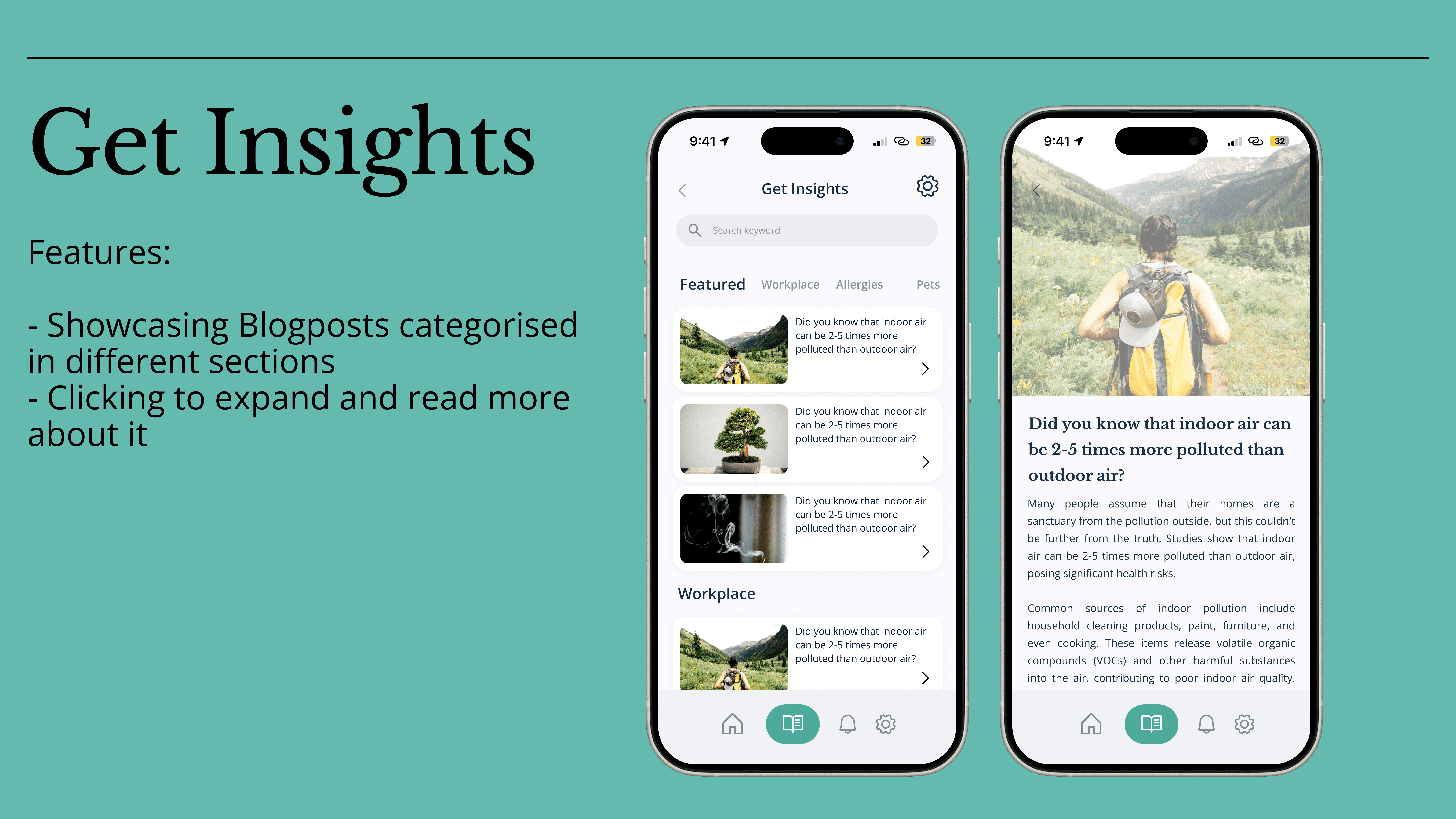
Translating raw air-quality data into actionable insights
Designing a dashboard that avoids data overload
Supporting behavior change without alarming users
Creating clarity for both indoor and outdoor data sources
Designing accessibility and readability into data-heavy screens
The product required strong prioritization, not more features.
Process at a Glance
The process focused on structure before aesthetics.
High-level flow:
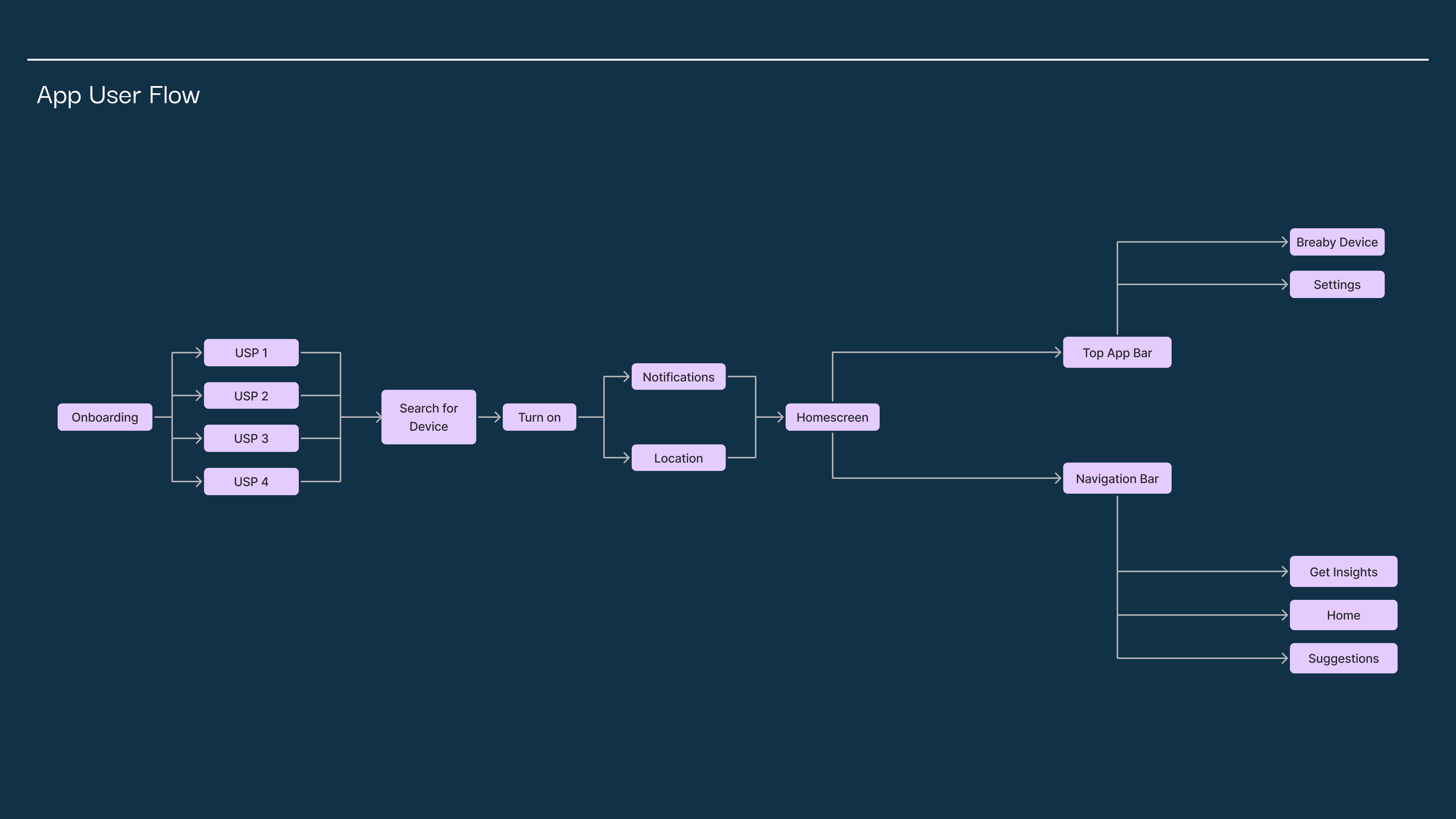
Understanding the device & data → Structuring information → User flows → Lo-fi wireframes → Hi-fi UI
Key steps:
Analyzed sensor data types and environmental standards
Defined how data should be grouped (indoor vs outdoor, current vs predictive)
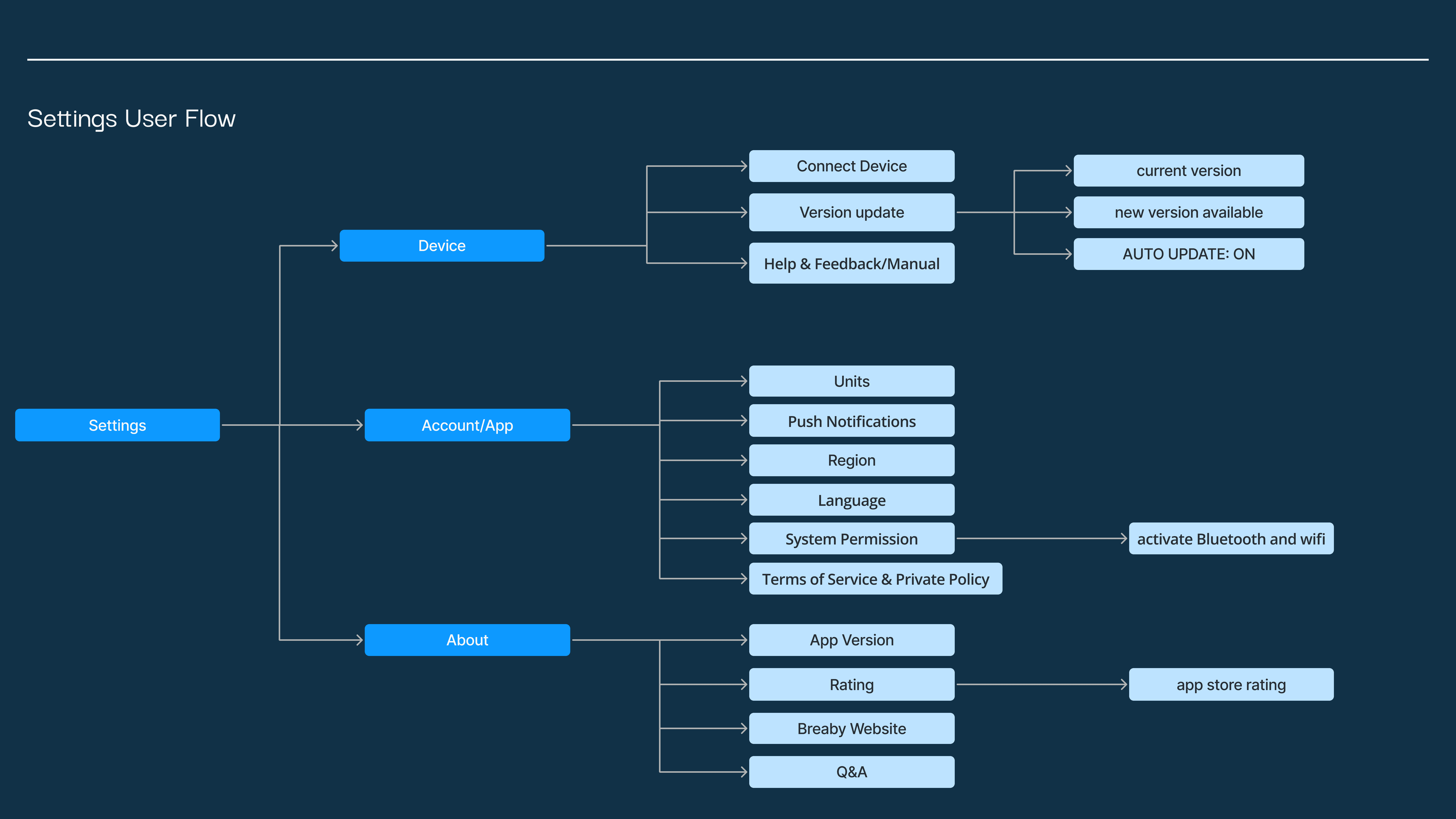
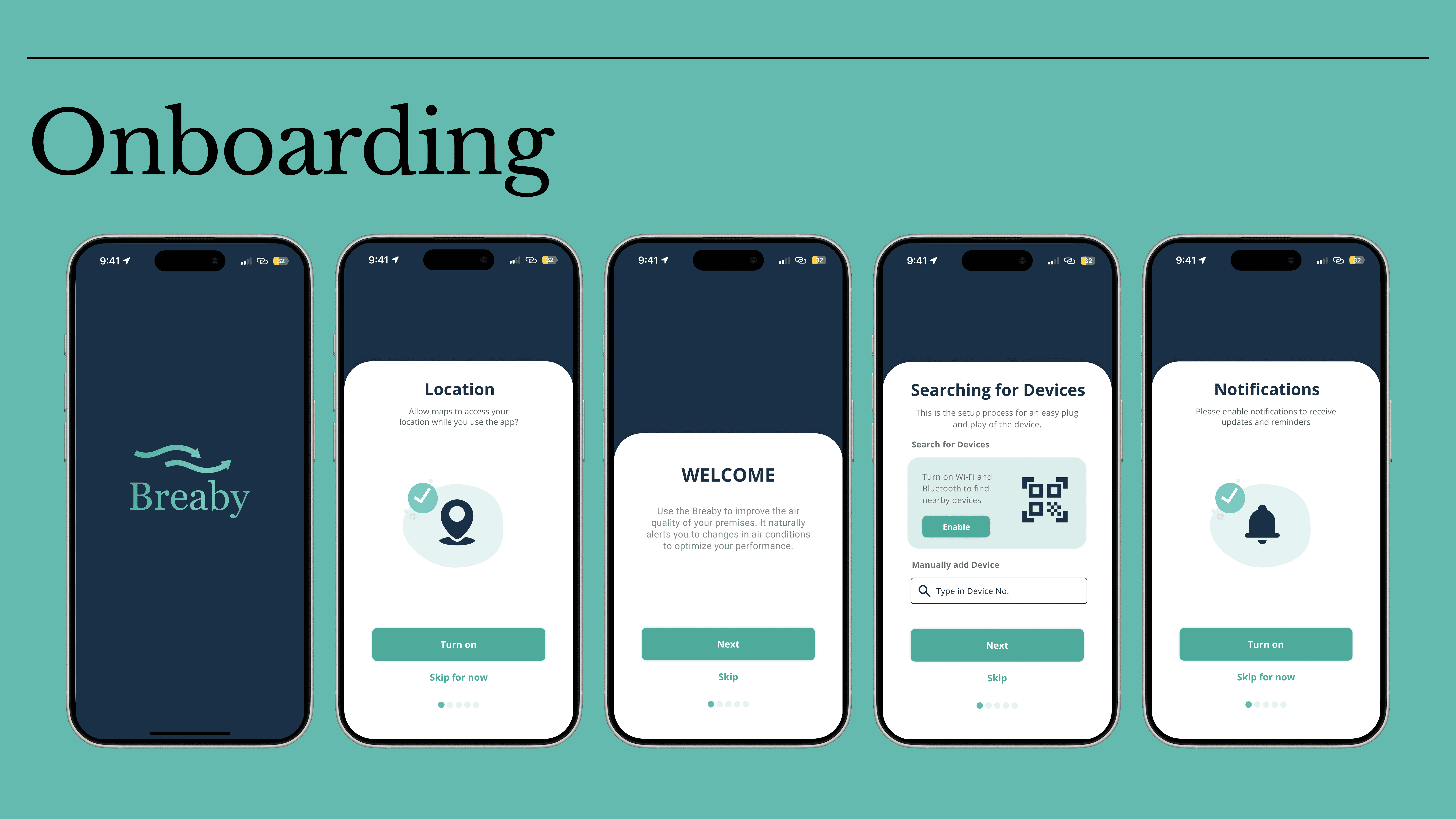
Designed complete user flows (onboarding, dashboard, settings)
Iterated from wireframes to high-fidelity screens in Figma
User flows for onboarding, home screen, insights, suggestions, and settings were defined early to ensure consistency across the app
Key Design Decisions & Insights
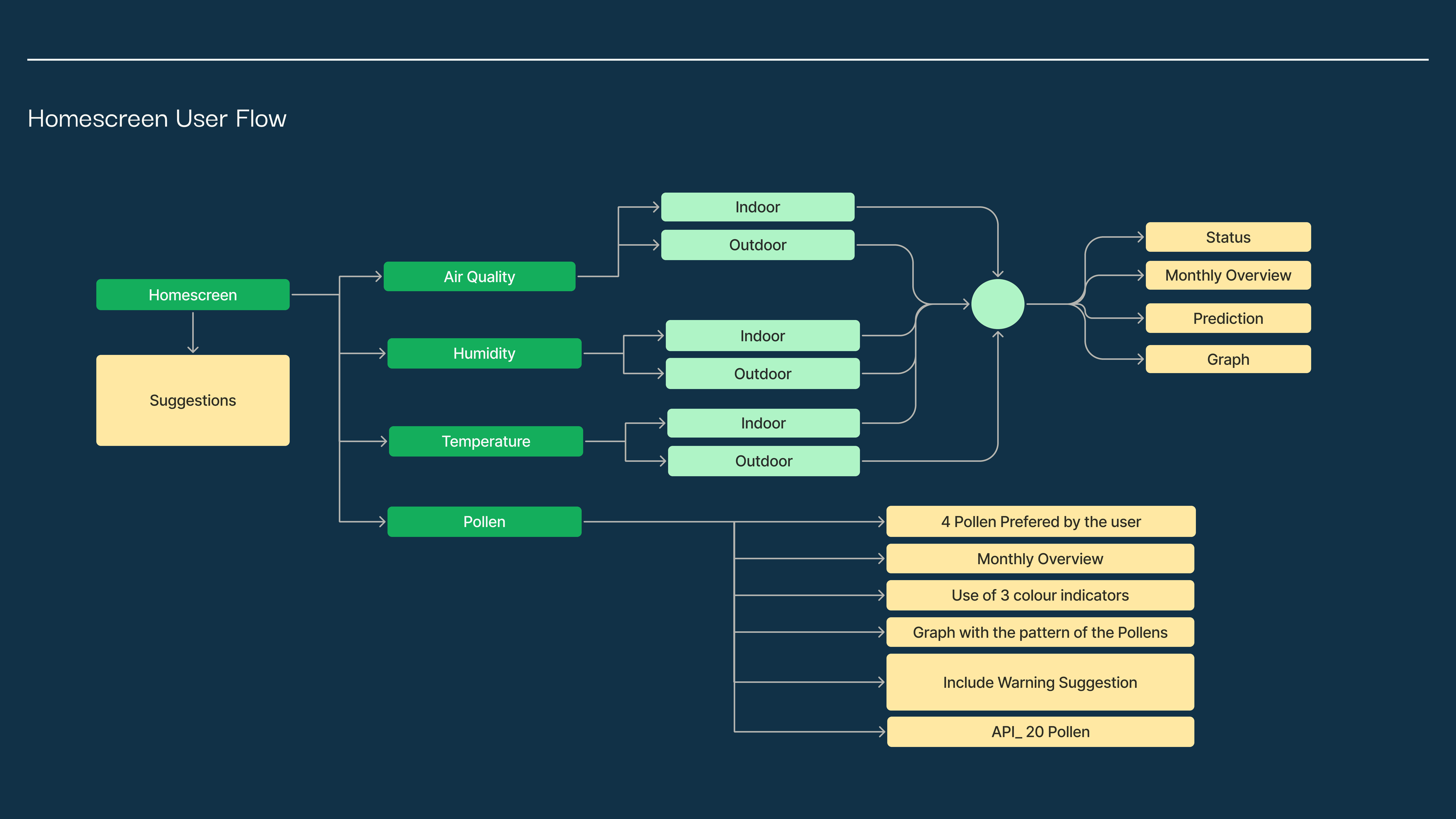
1. Dashboard as a decision space
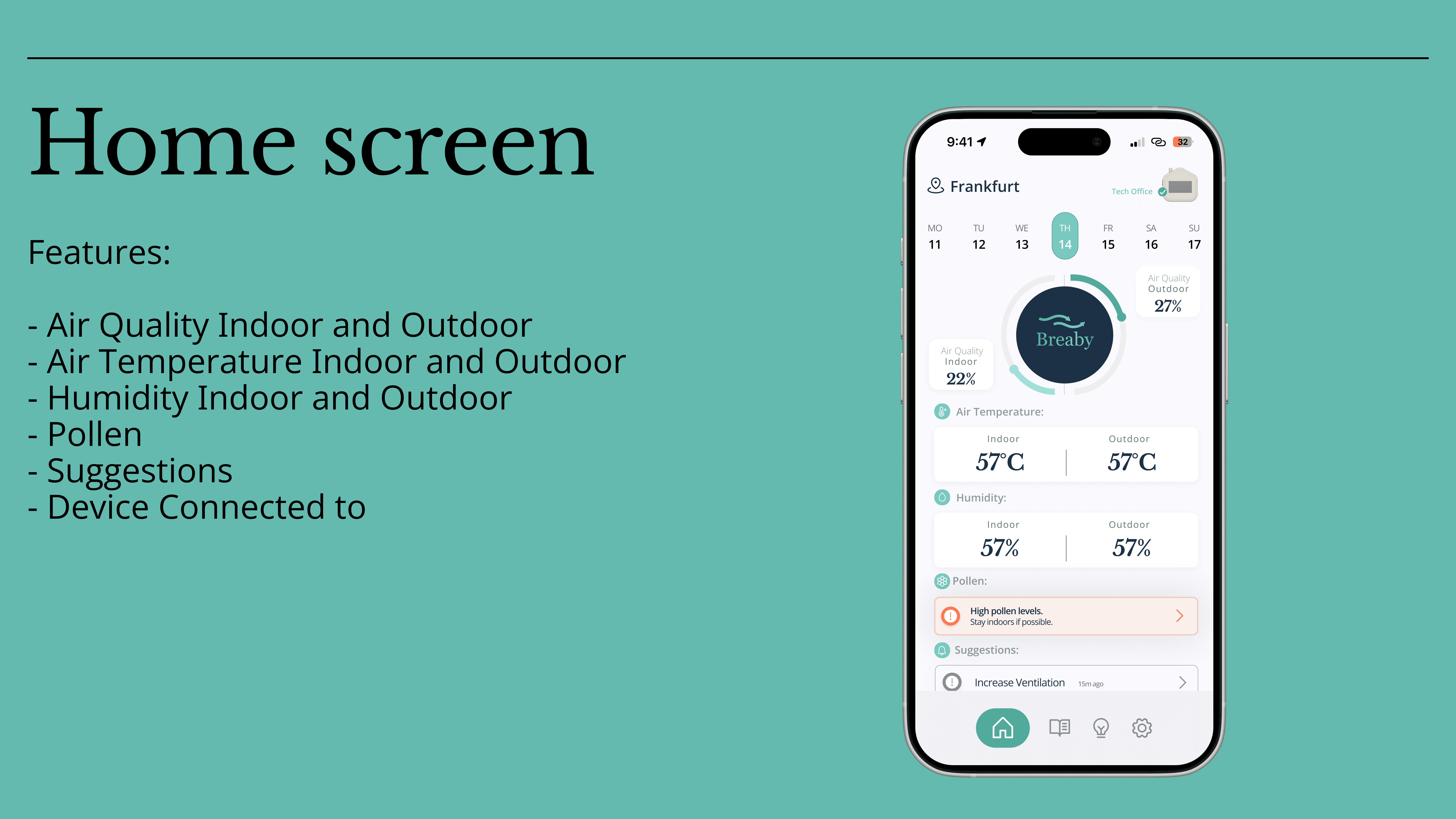
The home screen was designed as a daily check-in, not a technical monitoring tool.
Focus on status and trends instead of raw numbers
Clear separation between indoor and outdoor data
Visual indicators for “good”, “moderate”, or “needs attention”
This reduced cognitive load while keeping the data meaningful.
2. Data grouped by user intent, not by sensor
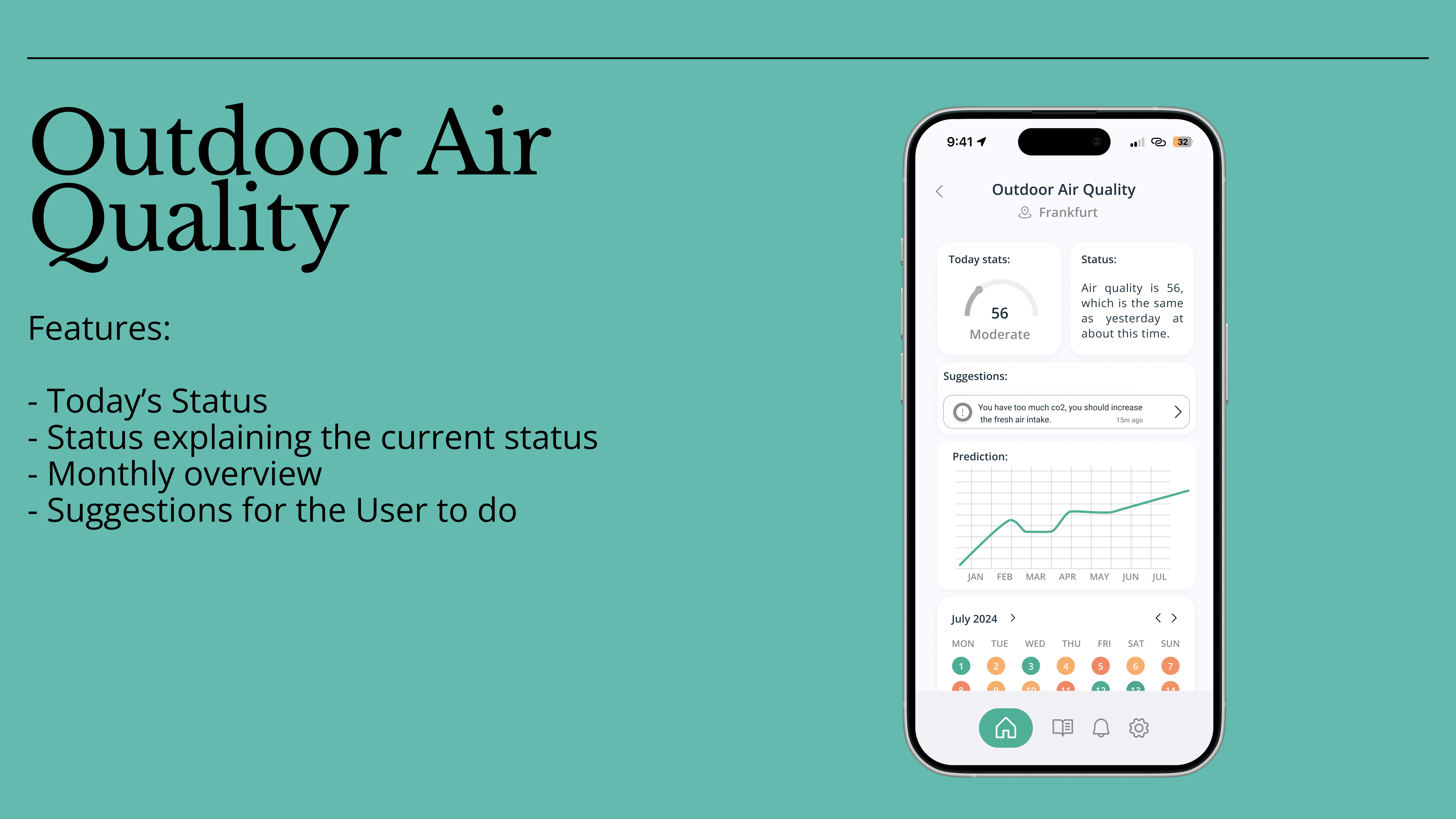
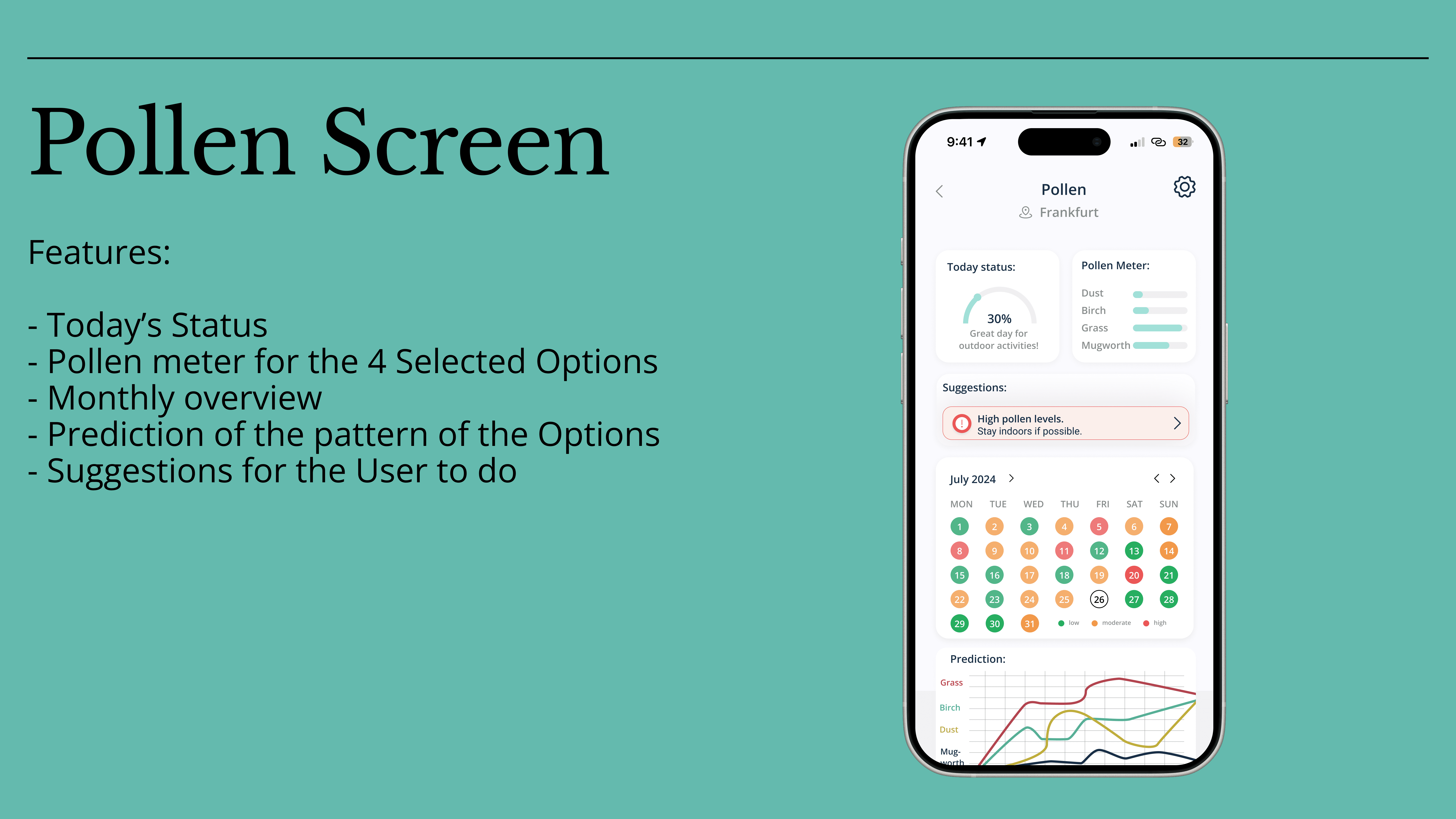
Instead of exposing all measurements at once, data was organized around user questions:
How is my air right now?
Should I ventilate?
Is pollen affecting me today?
This logic informed screens such as Air Quality, Pollen, and Suggestions
3. Calm visual language for a health-related product
The UI design followed principles of:
Minimal color usage
High contrast for accessibility
Generous whitespace for readability
The goal was to create a reassuring, non-alarming experience, even when data indicated issues.
Outcome & Learnings
Outcome:
A complete V1 mobile app design for the Breaby product
Defined user flows and interaction patterns
A scalable UI foundation for future feature expansion
Key learnings:
Data visualization is about interpretation, not display
Behavior change requires clarity, not urgency
Strong information architecture is critical in IoT products